
Juni Learning Redesign
Juni is an online learning platform for children and young adults focused on teaching coding as well as english, math and investing.
I joined the team during a full redesign of not only the brand, but some core features of the product. These features included things like creating a “home" space for students to land on, explore and return to.
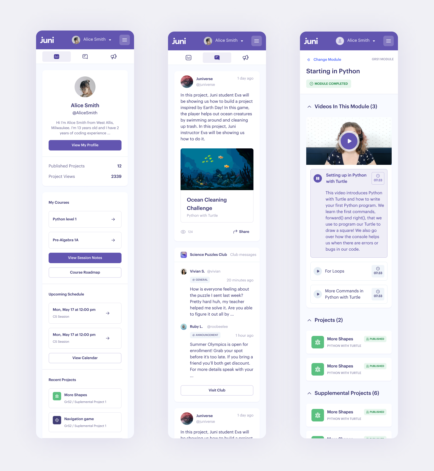
From a student’s perspective there was no way to view activity on the platform other than their own. Students were only able to navigate through courses they had signed up for and review past completed work or notes.

User Profiles & Portfolios
Profiles became an important aspect of the “Home” experience in that it gives students a place to showcase their work, clubs they’re a part of, and posts they’ve created. There are some extremely talented students on the Juni platform, and at a certian point they want to show their friends, parents, other teachers and even potentially future-employers things they’ve worked on.

Updated Navigation
With more course offerings and community features being added, the navigation system needed an overhaul. Previously a user could navigate through many, many levels of coursework via a drop-down heavy navigation pinned to the top of the page.
We found a lot of back-and-forth navigation patterns between projects within a specific module and decided it was best to break the modules out onto their own page. This allowed us to simplify the main course navigation into previous, current, and upcoming modules.
Responsive Web
This redesign (with the help of our design system) easily adapts to mobile layouts. There is currently no native apps for Juni, so our UI needed to be fully responsive.
While native apps offer a lot more stability and a lower barrier for entry, responsive made the most sense for us as a learning platform focused on computer science. The vast majority of users are on the platform doing homework, writing code or experimenting with something. None of these scenarios work well on a small screen, even natively. So responsive web became a “just in case” scenario wherein students might be checking if something is due, or a new course is available, but not doing any heavy lifting.

Design System
Having not previously had a widely used or robust design system at all, we took this opportunity to create something that would be more useful to our partners in engineering. This image is a small selection of some of the components in our system.
Partnering with engineers was crucial early on in this process and often. We treat the engineering team as the end-users of our Figma files and take the same type of approach as we would with any user of a product via research, feedback sessions and collaboration.